


5% of Google’s search queries are healthcare-related. That might not seem like a lot but that amounts to over 1 billion searches per day.
What’s more important to you is the specific topics, questions, and queries these users look for.
Maybe you just started a blog that provides accurate medical information to common questions as a way to increase your patient volume. Even if you don’t blog, new patients may stumble upon your website when looking to switch their provider. Both of those scenarios are awesome, but none of your efforts on the internet matter if you have an outdated website.
The point is, people are always visiting healthcare websites. Oftentimes, this is their true first impression of your organization. Because of this, your site must stay updated so that visitors won’t view your practice as poorly managed, insecure, or stuck in a different era.
Believe it or not, an outdated website sticks out. How your site’s structurally set up, what images it uses, and its content are all clear external giveaways to its age. However, there are also internal factors that only can tip you off as well. Let’s look at some of the telltale signs of an outdated healthcare website.

Table of Contents
Slow or Unresponsive Pages
The first sign that will indicate an outdated website is how fast it loads. Older code makes sites more sluggish. As technology gets faster and more complex, the code running in the background has to manage it all.
A good example of this is the release of HTML 5 in 2014.
Pages utilizing this code can store data locally on a user’s browser, eliminating the need for HTTP cookies so that content delivers faster. Other updates in HTML 5 allow for a faster and smoother experience because of its focus on mobile device compatibility.
Websites that don’t use updated code won’t be fast and 40% of consumers will flat-out leave if it takes your pages longer than 3 seconds to load.
Bad Overall Appearance
Design is what attracts users to your pages.
So, your healthcare website should have a modern appearance. That means you shouldn’t use fonts that look old or bright colored backgrounds that make it difficult to read your content.
The fonts you choose should be easy to read and formatted into headings and subheadings that separate different sections. Bad appearance can make it difficult to navigate a site. It’s enough to make anyone leave the page.

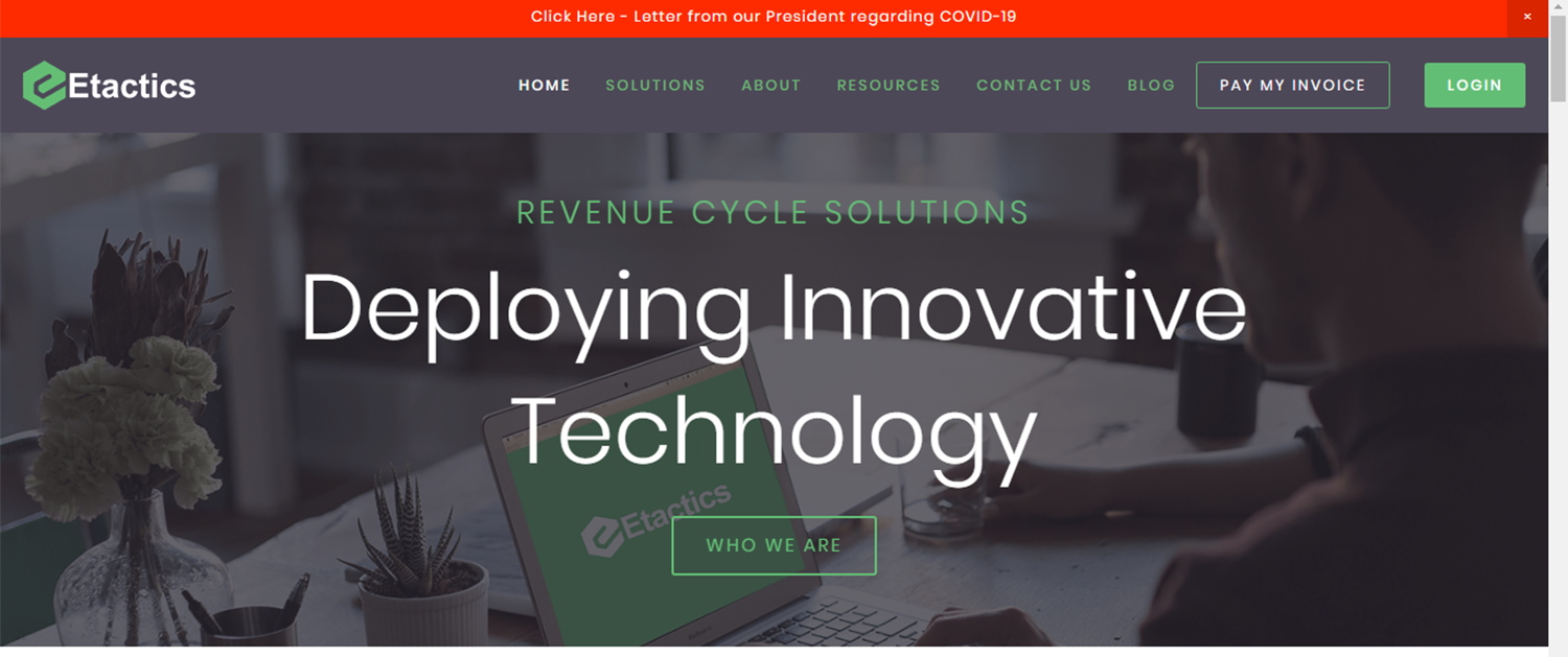
As an example, take a look at what our homepage used to look like in 2007. At the time, this was a state of the art design, equipped with an end-to-end green binary image. Could you imagine navigating to a site like this in 2020? If you were like the majority of users, you’d leave and never return.
The appearance starts with choosing a Content Management System (CMS), such as Wordpress or Squarespace. Squarespace is a good option for those who aren’t that tech-savvy and can afford the more costly service. Wordpress is more customizable as it has more themes and marketplaces devoted to widgets.
Not Mobile-Friendly
Smartphones and mobile devices rule the internet. In quarter four of 2019, they accounted for 53% of all global internet traffic.
They’re also convenient for accessing health services on-the-go. Evidence of that statement comes from the growth in telehealth services. But this means websites need to have a mobile-friendly interface.
Have you ever been using your smartphone and the web page defaults to a zoomed screen? You have to pinch-zoom in and out on your screen just to access navigate around to where you want to go. This is clunky.
If your website isn’t mobile-friendly, it comes off that your organization isn’t staying updated on current trends.
Missing Links and Buttons
Websites are a living, dynamic series of pages hosted on the internet. What I mean by that is you need to run checks every so often to ensure that everything works.
Specifically, if you have broken links on your pages, they’ll look old. When links lead to unresponsive or error pages, not only does it negatively affect your user experience, it also makes it harder for you to rank on the first page of Google.
Furthermore, how user-friendly your buttons are matters as well. No one likes having to zoom in on their screen to click these, they should be dynamic.
What I’m trying to say is that words and buttons will appear different on a computer than on a small phone screen. If users need to zoom in on their phones to click something, it shows that user interface isn’t a priority to your organization. Likewise, word and graphics shouldn’t be too big where the user would need to zoom out.
Words or buttons shouldn’t appear to link to something if they don’t. For example, social media icons usually link back to the company’s social media pages. Underlined and/or colored text usually indicates that it links to another web page with similar information. If something looks like it will go to another page when clicked, then it should. Doing this is not only outdated, Google considers it as malicious, flag you as malicious, and remove you from their database altogether.
Insecure Certificate
Users can tell if a web page is secure by its URL. If the URL displays “https,” it indicates that it’s secure with a Secure Sockets Layer (SSL) certificate. This technology authenticates the identity of the site and encrypts data sent to the server. There will also be a locked icon next to the URL.

With so many cybersecurity risks, companies need this SSL certificate to protect their online users. Most online businesses must have these certificates. If a site doesn’t have these, they’ll seem antique since they aren’t focused on the users’ security.
Poor Navigation Structure
There are a variety of navigation styles to choose from when you’re first designing your site. If a website has a poor navigation structure, it’s not up to snuff with what's expected from today’s internet.
One of Google’s biggest recommendations and ranking factors is user-friendliness. It’s so important to them because 88% of online users are less likely to return to a site after a bad experience. So by removing those listings that aren’t optimized from their search engine, they’re inadvertently boosting their own user experience (UX).
But boosting your UX doesn’t have to be hard and simple, modern additions could go a long way.
For example, the “Back to Top” button. This is an ever-present button on the bottom right or left-hand corner that allows jumps the user to the beginning of the page when clicked. It’s convenient and much faster than scrolling, especially for longer pages.
Navigation bars can also give you a huge boost, depending on their layout. There are a few ways to display them for easy use, such as
Vertical menu
Mega menu
Sticky menu
A mega menu is perfect when there is a lot of content to display. It breaks up the information into columns so users can view it all at once, rather than having to scroll.
Vertical navigation is on the side of the page rather than the top, so users can again see it as they scroll. These might use icons rather than words to display the information, adding another modern touch.
Sticky navigation locks the menu in place. As users scroll, it will stay at the top of the page so they can see their search options and head to a new page without scrolling back up.
University Hospitals uses a sticky menu so that as users scroll, they can still access other search options. Not only that, but as soon as a user scrolls from the top of the page, a “Back to Top” option appears. This makes navigation even easier, and also enables users to find what’s most important. Too many options are overwhelming, but simplifying this into digestible menus helps.
Lacking Up-To-Date Content
So if the design is what attracts users to your pages, content is what keeps them there.
If there isn’t recent content on your site, then it’s viewed as inactive by search engines. Google and Bing are constantly crawling billions of domains across the world for up-to-date and accurate content.
By ignoring your copy and letting it sit there for years, you’ll get less traffic over time.
Anthem has a section on its homepage dedicated to stories. It includes links to some posts which visitors would find helpful plus the option to view all stories. It’s beneficial to include these on the main page so visitors will more likely see them.
Missing Testimonials
This is one piece of content that shows your practice is updating your content while giving you credit as an expert. Patient testimonials are a popular tactic for getting new clients. Prospective clients are always looking for reviews before determining whether or not they should choose a particular service.
If you haven’t started asking your patients for testimonials, you’re behind on this trend. However, that doesn't mean you should beat yourself up about it. Instead, be proactive and look at examples of what’s already out there.
Ohio Health includes these on their robotic surgeries so that new patients can get insight into the more recent process.
The healthcare industry doesn’t stop changing. You know this. By staying current with your testimonials, you’re helping your brand image and making a concerted effort toward updating your content.
By keeping your testimonials stagnant, new visitors will assume that your clients aren’t giving positive reviews, or think you’re no longer in business at all.
No Award Showcasing
Showing off your practice’s achievements and awards isn’t a new concept. But not displaying them online can cause people to question the credibility of your practice. Without knowing what you’ve achieved, new visitors won’t know if you’re credible.
Maybe you haven’t received any awards to showcase. This doesn’t mean you’re out of luck, it just means you’ll have to get a little bit more creative. One way is to include information on expert staff members. The Ohio State University Wexner Medical Center does this on the page dedicated to its people.
Another way is to include any internal achievements such as new or improved solutions. This helps show that the organization continues to progress and stay updated with emerging trends in healthcare.
Lacks Online Scheduling and Bill Pay Options
Younger generations value convenience and digital options. Their preferences are such a driving trend right now that websites seem outdated if they don’t offer online scheduling and payment options.
Their biggest hurdle when it comes to healthcare is that they’re busy and cite their work as one of the main reasons why they reschedule or cancel their appointments. This means the practice they choose needs to offer quick, accessible scheduling options. They’re more likely to use a practice if they can quickly schedule an appointment with just a few clicks of a button.
It also doesn't hurt that your existing patients could do what they need to from anywhere, at any time.
It’s becoming an older concept to write a check and mail payment or call to pay over the phone. These trending options are here to stay so you might as well embrace them.
Disregard for Chat Messaging
Like I’ve already mentioned, people value convenience in their healthcare more than ever before. With fast-paced schedules, clients don’t want to have to make a call or email if they have a quick question.
Communication with a real person takes too long between hold times on the phone or awaiting an email response. Sometimes, they will also have questions during outside office hours when no one can take their call.
But so many companies now include messaging features online, whether it’s through instant messaging or chatbots. These enable visitors to get their questions answered fast.
Customers use them frequently since they prefer getting questions answered online, and 67% used chatbots in the last year. If a website doesn’t offer this instant communication, page visitors will think they’re behind.
No Access to Electronic Medical Records
Most practices have moved toward using electronic medical records rather than paper records. One of the benefits of this is that it enables patients to access portions of their records online.
They can view test results, current health issues, track immunizations, and more. These secured systems are accessible 24/7 which boosts convenience. The Cleveland Clinic does this well through their MyChart system. The system also has the option to schedule appointments and message a physician.
This is another section where, if you’re not taking advantage of it you’re falling behind. It streamlines processes so that patients don’t need to call or visit the organization to access their records. It also keeps the records in a secured system so that there are no privacy issues with sending them electronically such as through email.
Difficult to Find Information
If a website stays updated, users won’t have to spend any extra time trying to find the most relevant content.
But as a general rule, the most relevant and current information should be the easiest to find. You shouldn’t send your users on a scavenger hunt to find the page they need.
For instance, Summa Health includes contact information at the very top of their homepage for both appointments and general questions. It lists three of the most important features: booking appointments, finding a doctor, and using virtual visits.
It even includes the same options at the bottom of the page. This way, as patients navigate further down, they’ll still see the most helpful information.
Missing Analytics
Poor analytics can be a sign that your website is too old. People will spend less time on your pages, there will be less engagement and fewer impressions, and there’s slow traffic altogether.
Lower numbers mean that you have something to improve. While there could be plenty of reasons for tanking numbers, many could point to an outdated website. If it looks unappealing, it will be uninviting. If it’s difficult to find important information, potential clients will get frustrated and leave. These analytics give you evidence that can indicate you may need to update your online platform.
When someone Googles the name of your practice, your domain should be the top result.
If it isn’t...don’t panic. There are a few easy things you can do to salvage your rightful place on the first page.
First, you should look into Google My Business. In a nutshell, it’s a service that links your website with Google’s location and linking services. In other words, it tells the search engine you are who you say you are.
Second, create blog content. Blogging about topics you know about will help boost your reputation as an expert in your field. It also further solidifies your position in search engines.
You Don't Remember the Last Time You Updated Your Website
The most obvious sign for your practice to know whether or not your site is old is if you don’t remember the last time you updated it. The healthcare industry is always changing, so odds are that the way your practice runs is too. In other words, if your practice is changing then your website should too.
For example, during the COVID-19 pandemic, almost all websites had an alert announcing how they were responding to the issue. This was especially necessary for healthcare organizations who were on the frontlines. If a web page didn’t have this, viewers saw the company as insensitive or even clueless.
If anything happens at your organization that affects your patients, it should end up on your website in some capacity. It’s one of the easiest ways to keep clients informed since they’re already visiting to schedule appointments with you. If they aren’t, then it might be because the site falls into one of the categories I mentioned above.
Is The Website HIPAA Compliant?
With the passage of the HIPAA regulations, it’s extremely important that the website is HIPAA compliant.
There are hefty fines for non-compliance, so it is important to not only make the website compliant but also make sure that the records of the patent are fully protected with HIPAA Hosting.
That way you can ensure that you're not only abiding by government mandates while keeping your visitors’ minds at ease.
Conclusion
Since patients use the internet so much for finding health information, they’re likely to end up on your practice’s website at some point. But to constantly boost your traffic and appointment rate, you’ll need to dazzle these visitors through design and content.
That simply can’t happen if you have an outdated website. Visitors will get frustrated with how slow it’s loading, its aesthetics, its overall structure, and its content.
For these reasons, you must use current features and relevant information online as a healthcare organization.
Start the process by running an audit on your website. Visit your pages and see how long they load, re-read that page you published two years ago, and click on your links to make sure they work.
Find out what’s outdated within your website and fix it. You’ll thank us later.
