Mary Madison, RN, RAC-CT, CDP
Clinical Consultant – Briggs Healthcare
“Vaccines have proven to be spectacularly effective in preventing death from Covid-19, but the U.S. continues to struggle with keeping Americans up to date on vaccinations. (The Brown School of Public Health) Vaccine Preventable Deaths Dashboard shows that since vaccines became widely available, every second Covid-19 death could have been prevented by vaccines.”
Please read the above statement again. Let it sink in.
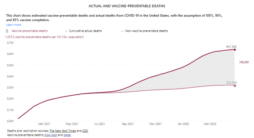
Here’s what that dashboard shows:
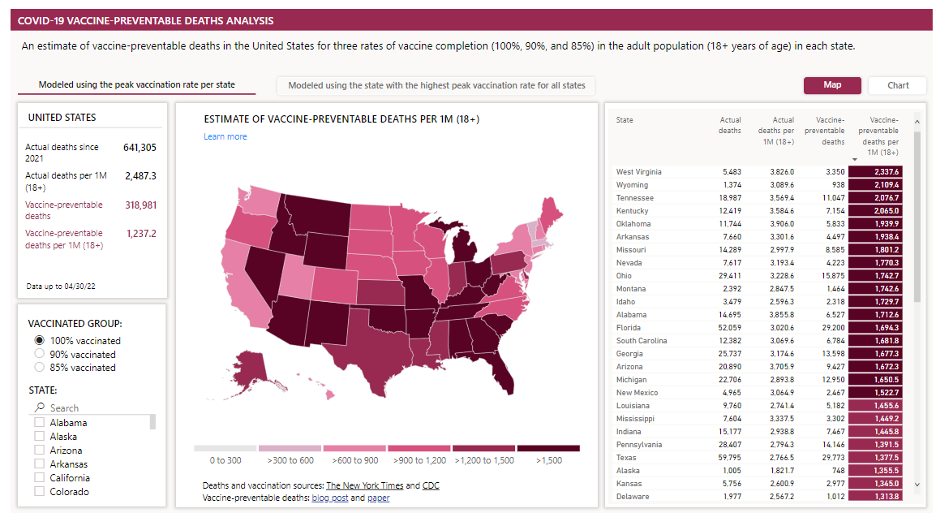
I encourage you to view the dashboard via the hyperlink provided in the 1st paragraph of this blog to explore the data. You can access the Modeled using the peak vaccination rate per state data (shown above) or Modeled using the state with the highest peak vaccination rate for all states data. Click on the Chart option to view this data:
There are several filters including search by state and 85-90-100% vaccinated groups.
“This dashboard shows the number of vaccine preventable deaths per 1 million residents for each state as well as nationally. It is based on an analysis by our team at the Brown School of Public Health, in collaboration with Brigham and Women’s Hospital, Harvard T.H. Chan School of Public Health, and Microsoft AI for Health showing that between January 2021 and April 2022, vaccines could have prevented at least 318,000 Covid-19 deaths. This means that at least every second person who died from Covid-19 since vaccines became available might have been saved by getting the shot.
The dashboard models vaccine-preventable deaths based on real-world data from the Centers for Disease Control and Prevention (CDC) and the New York Times. Using observed weekly numbers of infections, deaths and vaccinations for each state, the dashboard displays an alternative scenario: What if the pace of vaccinations at the point of highest demand last spring for each state was sustained, until vaccination coverage reached 85, 90, or 100 percent of the adult population?
The dashboard serves as a resource for states to build trust with their residents and close the gap in vaccinations. It shows not just where we are in the pandemic, but where we could – and should – be with a renewed focus on vaccinations.”
I became aware of the Brown School of Public Health dashboard via an Axios Des Moines article on May 20, 2022. That article addressed Iowa specifically but also included this graphic:
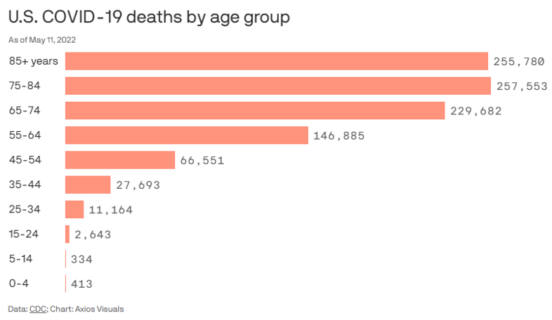
You’ll find these statements in the Axios Des Moines article. (Access that from the hyperlink above the U.S. COVID-19 deaths by age group chart to read the information between the hyperlinks below.)